
Use this guide to read the headline numbers and charts of a survey's responses and to filter the charts by date. For survey creators.
Open the analytics for a survey
- Open the survey in InPoll.
- In the survey menu, click Summary.
- Click the Analytics tab.
Read the summary row
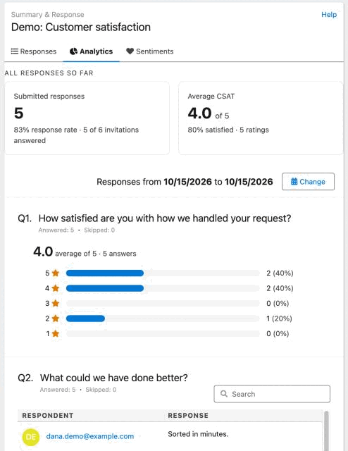
The row All responses so far opens the tab. It counts every response of the survey. The date range below it does not change these numbers. It has up to three tiles.
- Submitted responses: the number of submitted responses, with the response rate. For example, 83% response rate · 5 of 6 invitations answered. The response rate is the invitations answered divided by the invitations sent. It leaves out failed invitations. If you sent no personal invitations, the tile says No personal invitations sent yet.
- Average CSAT: the average rating, for example 4.2 of 5, with the share of satisfied answers and the number of ratings. Satisfied means a rating of at least 80 percent of the scale, for example 4 or 5 out of 5. This tile shows only when the responses have a CSAT score.
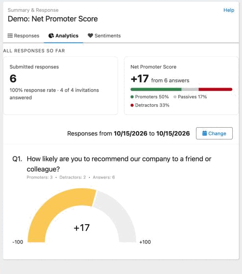
- Net Promoter Score: a number from -100 to +100, for example +17, with the number of answers. Below it, a bar and a key show the share of promoters, passives and detractors. This tile shows only when the responses have an NPS score.
InPoll takes the CSAT score from the first rating question of a survey that is not an NPS survey. It takes the NPS score from the first rating question of an NPS survey. See Reports: CSAT, NPS and response rate.
Read the question charts
Below the summary row, the tab shows each question of the survey with its answer counts. The format depends on the question type.
- A rating question in a survey that is not an NPS survey shows one bar for each score, with the highest score first. Each bar has the number of answers and their share. Above the bars, the average score is shown, for example 4.2 average of 5, with the number of answers.
- An NPS question shows a gauge from -100 on the left to +100 on the right, with the Net Promoter Score in the middle. A list shows the number of Promoters, Detractors and Answers.
- Other questions with options show a donut chart (a pie-style chart). Each section is one option. The list shows how many people answered and skipped the question.
- Other question types show a table with the user name and the response.
Charts and tables help you spot patterns in the responses and decide what to do next.
Filter by date
Above the question charts, a line says Responses from a start date to an end date. At first, the range starts on the day the survey was published, or on the day of an earlier test answer, and ends today.
The date range controls which responses the question charts and tables include. Only responses submitted within the range are shown. Responses submitted outside the range are not included, so keep this in mind when you read the results.
Apply a date range
- Open the Analytics tab of the survey.
- Click Change next to the date range.
- In the Filter Response By Date window, select a Start Date and an End Date.
- Click Apply Filter.
The charts and tables now show only the responses in that range. Repeat these steps to change the range.
Clear a date range
- Open the Analytics tab of the survey.
- Click Change next to the date range.
- Click Clear Filter.
All responses show again.
Good to know
- To download responses as a CSV file, use Export on the Responses tab. See Export user responses.
- To see the numbers of all your surveys together, use the Dashboard tab. See Monitor surveys on the InPoll dashboard.