
Use this guide to open the InPoll dashboard and read its survey, response, CSAT and NPS numbers. For admins and survey creators.
Open the dashboard
- Log in to Salesforce.
- Open the App Launcher.
- Select the InPoll app.
- Click the Dashboard tab.
Read the top row
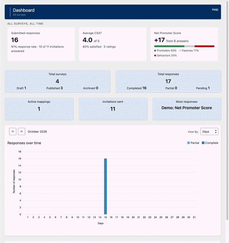
The dashboard covers all your surveys. The first row is called All surveys, all time. It counts every response so far. It has up to three tiles.
- Submitted responses: the number of responses that were submitted, complete or partial. Under it you see the response rate and how many invitations were answered, for example 80% response rate · 4 of 5 invitations answered. If no personal invitations were sent, it says No personal invitations sent yet.
- Average CSAT: the average rating out of 5, with the share of satisfied answers and the number of ratings. It shows only when responses have a CSAT score. Surveys with other rating scales are compared out of 5.
- Net Promoter Score: a number from -100 to +100, with the share of promoters, passives and detractors. It shows only when responses have an NPS score.
Satisfied means a rating of at least 80 percent of the scale, for example 4 or 5 out of 5. The response rate leaves out invitations that failed.
Read the tiles
- Total surveys: the number of surveys, split into Draft, Published and Archived.
- Total responses: all responses, split into Completed, Partial and Pending. Completed responses are fully completed surveys. Partial responses are surveys that were started but not completed. Pending responses are not submitted.
- Active mappings: the number of active response mappings. See the guides under Write Answers Back.
- Invitations sent: the number of personal invitations sent from the Send screen or from a Flow, not counting failed ones.
- Most responses: the name of the survey with the most completed responses.
Responses over time
The bar chart Responses over time compares Complete and Partial responses.
- In View By, choose Days or Months.
- Use the arrow buttons above the chart to move to the previous or next period.
- Point to a bar to see its count.
A donut chart next to it shows the share of responses that each survey received in the month shown, with the total number of responses in the center. Use its arrow buttons to move to another month.
Help
Click Help at the top of the dashboard to open the documentation for the dashboard.
Tips
- Check Responses over time to see trends in participation.
- Compare Complete responses with Partial responses to see how well a survey works.
- Look for the days with the highest and lowest engagement, and use them to choose when to send future surveys.
- For one survey, open its Summary and click the Analytics tab. See View survey analytics.